At the FRED Blog, Debt- and deficit-to-GDP dynamics. Three scatter plots of government debt versus government deficit since 2001. Graphs for the U.S., Japan, and the Euro Area. I will only look at U.S. data.
The opening sentence of the FRED Blog post:
Several historical examples show that financial crises generate large increases in private and public debt that take many years and sometimes drastic measures to resolve.
Sadly... ironically... typically, they speak of "private and public debt" but they only look at public debt. That's okay. I'll fill in the blank.
Here's the first graph from the FRED Blog post:
 |
| Graph #1: Federal Debt (vertical scale) versus Federal Deficit (horizontal scale) 2001-2013 |
(If you know that the Federal debt for 2013 was the highest since World War Two, you can tell that the highest dot on the graph is the 2013 dot. And if you know that 2009 had the big increase in Federal deficits, and that the deficits have been getting smaller since, you can tell that the leftmost point is the 2009 dot. I didn't remember those things, so I had to look around some.)
I followed the blog's "customize" link to the FRED source page and pushed the start-date back to 1970. So we can see all the dots on the first graph, and more:
 |
| Graph #2: Federal Debt (vertical scale) versus Federal Deficit (horizontal scale) 1970-2013 |
Easier to see now: The 2008 dot is the last in a cluster. For some reason the color setting changed when I changed the start-year. I couldn't duplicate their setting.
What this graph shows is that, before 2009, the Federal deficits ranged between zero and six percent of GDP. It also shows the budget surplus of the Clinton years. Looks like four years in surplus, with a maximum surplus of just over 2% of GDP.
During that time, 1970 to 2008, the Federal debt ranged from 30 to about 65% of GDP: never over 70%, but tending to increase rather than decrease. The big, massive jump from 2008 to the leftmost dot, 2009, pushed debt up over 80% of GDP. A slowing economy (I mean, slowing GDP growth) also helped push the dots higher.

Since the FRED Blog failed to do it, I thought I'd look at Federal debt versus non-Federal debt:
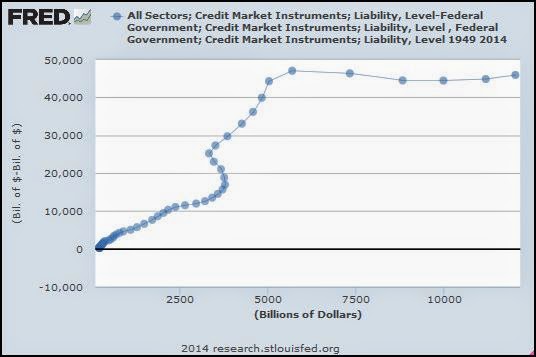 |
| Graph #3: Federal Debt (horizontal) versus Non-Federal Debt (vertical) 1949-2013 |
Before 2008 there is a general upward trend. The dots climb with regularity from the start. Then there is a sweep around to the right and back to the left. Suddenly, then, it turns a "corner" and climbs with regularity again toward 2008.
Counting backwards from the rightmost dot again, 2013, it turns out that the dot at the "corner" represents 2001. The leftward sweep for the few years before 2001, just below it on the graph, show the latter Clinton years when the Federal budget was coming briefly into balance.
On Graph #3 the horizontal scale (which shows the size of Federal debt) runs from zero to something over 10000. The vertical scale (which shows the size of non-Federal debt) runs much higher, up to 50,000. But here's the thing. On the vertical scale the distance from zero to 10,000 is about half an inch, maybe less. On the horizontal scale the distance from zero to 10,000 is about 3 inches, maybe more. The two scales are quite different.
I re-sized the graph to make 10,000 vertical about the same size as 10,000 horizontal. This should give you a better feel for the relative sizes of Federal and non-Federal debt. Horizontal distances measure Federal debt. Verticals measure everyone else's debt:
 |
| Graph #4: Federal (horizontal) v NonFederal (vertical) Debt, Similar Scaling |

No comments:
Post a Comment