Not sure who I have to thank for this. I Googled graph of US real output since 1800 and turned up macromath_v2.pdf. The URL includes the words "nordhaus" and "yale.edu" so, Professor Nordhaus maybe.
Let’s graph US real GDP since 1800 using an arithmetic scale and a logarithmic scale. Also show a constant growth curve in the log scale. Which is more useful?
From this example, you can see why economists like to put log(xt) on the vertical axis for output, prices, and other trended variables. Because a series with a constant growth rate is a straight line!
|
|

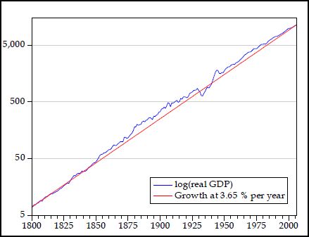
Because a series with a constant growth rate is a straight line!
Yesterday I said
It is always an unwavering path, a straight line on a log chart. This straight-line path is the universal, fundamental assumption, whether we think it exists or not.
The straight line is the wrong picture. The long-term trend looks like a sine curve. It looks like a business cycle, only longer than the normal business cycle. Longer than a Kondratieff wave. Longer than David Hackett Fischer's Great Wave. I'm looking at a really long business cycle, what we normally think of as civilization, the rise and fall of civilization.
The Log Graph above shows the "straight line" that economists always assume. But the logged data shows a curve that, relative to the straight line, is high in the center and low at the ends. It is some kind of curve. A sine curve, maybe.
The graph runs 200 years, from 1800 to 2000. That is one-tenth of a 2000-year cycle.
No, I don't call this evidence. But I do call it interesting.

No comments:
Post a Comment